We have many older neighborhoods all over our city that have some really neat architecture dating back to early 1900's and some even earlier. Our neighborhood was built in 1947 and most of the surrounding areas are about the same or a little older.
This area has always been rather neutral when it comes to house colors. The homes that are not brick or stone tend to be white, beige, pale yellow or blue or gray. Boy is that changing.
I am not sure how I feel about it either.
I do like the older homes that have a great accent color on the trim or an accented front door. We also have a lot of homes with fret work (gingerbread as we call it) on the corners and porches. I love those older, kind of Victorian looks.
The home across the street was purchased last fall and they painted a very dark gray with black trim. Not bad - totally different from rest of neighborhood. I looked out 2 days ago and they added shutters and painted the door.

If any of you have ever seen the HGTV show Good Bones, that is filmed about 10 minutes from our house. The gals have been renovating and flipping homes for a few years in that area. Their business name is 2 Chicks and a Hammer - it's a Mom/daughter duo.
THEY seem to be responsible for the huge change in landscape. Once they started doing their reno's - more bright colors and modern architecture took over the those older neighborhoods. I do not like the modern architecture at all - they totally change the beauty of the areas.
They don't 'rehabilitate back to original' - they renovate totally different. Just seems wrong to me. Call me old fashioned!
Good part is the housing market is starting to rise some - bad part is taxes are starting to rise as well.
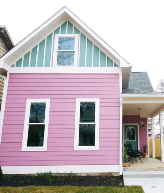
Here are a few of the of homes the Good Bones show renovated within 10 - 15 minute drive of us.

Not of fan of the stripes

Siding going in 2 different direction - this one is really a shade of chartreuse in real life. I do like the door!
Cute for a play house - just can't get my head around purple
This has definitely become the trend in the Fountain Square & Bates Hendricks areas (which are minutes from us). I guess they are going for a young/hip buyer - not us older folks.
Now it is starting to trickle into our neighborhood. I guess we will have to wait and see what happens.
Surprisingly some of the choices are growing on me!
Funny, I was checking out real estate available in these areas, and "normal" generic colored homes sell for almost nothing and these brightly colored ones are selling for 3X - 4X more, some even higher. CRAZY!!
I have decided (actually decided a while back) that I want my doors a different accent color. House is white, shutters are hunter green - so I am currently looking for a different color I can 'live' with. They are now white.
So what say you? Do you like? Is this happening in other areas?
I am curious.
Not really my style but in a beach town it would be great!
ReplyDeleteThat is my thought. It does look like coastal beach resort cottages.
DeleteWow, those colors are a bit much for me personally. They look like doll houses, and they would look cute as beach houses. We do have a purple house in our area that is a stained glass studio, and I think that looks pretty good.
ReplyDeleteI guess I am more traditional. Our house has light gray siding with hunter green shutters. Dh thought it was strange that I wanted to paint the door hunter green instead of white; I am sure he wouldn't have liked the chartreuse or pumpkin colors. :D
They do look like doll houses. I can understand a business or studio doing that - it would be perfect. it would attract customers.
DeleteI am more traditional as well.
The house across from us is growing on me a little - I have to look at it daily, so I better get used to it!!!
I don't think chartreuse will ever be an accent for us as well.
The cul de sac behind us has 6 houses around and out. 3 of them are painted charcoal. Not grey...nearly black. They are ugly. I call that sac "the nightmare before Halloween.". All my friends comment on them. I know they were painted without HOA approval. Our house is a grey/green with cream trim. Utterly forgettable, but we like it and it's HOA approved, which is what we agreed to when we bought it.
ReplyDeleteLOL - I would probably think the same thing. They don't sound attractive.
DeleteOur house is forgettable too! It just blends in with everything else.
I guess some people just want to make a statement. AND they DO!!!!!!
Don't think of it as forgetable, think of it as classic. Classic stands the test of time.
ReplyDeleteAmen - love that!!!!!
DeleteI like the bold colors. But you can always try out colors on one of the paint sites. They will allow you to upload a picture of your room or house and then try on different colors in their palettes.
ReplyDeleteI don't mind bold as an accent - just don't want the whole house bold. I love that feature for trying out paint colors without commitment.
DeleteI watch Good Bones. I don't care for any of the colors on the 3 photos above. The 3rd one is awful IMHO. Have you ever been able to watch as they work on a nearby house? thanks
ReplyDeleteI have never gone and watched. I should do that some time, If I knew where they were working. Those projects are done several months before we see them on the show.
Deleteabout 10 years ago a couple moved in across the street and painted the house bright sunshine yellow. It actually hurt my eyes when I opened the curtains ha ha. It's now owned by someone else and the color as changed thank goodness. I do like color but maybe not so bright. I think people are much more bolder than I am. I'm more low key.
ReplyDeleteI can imagine that was bright. I am more low key as well.
DeleteI really think it is something used to draw in the young, hip, funky artistic types.
I mean there HAS to be a reason!
In the town where I used to live there was a beautiful old German house (the town was settled by Germans, no offense meant to anyone). As the years went on it was painted white and the trim was turquoise, just the trim near the roofline. That one trim, with the house white the porch white, the door white was very striking and I loved it. As time went on it was bought and they put on dark grey trim, added dark gray shutters, and something changed, the spirit wasn't bright, light and airy anymore. So my recommendation is that "less is usually more" and one good stroke of color is usually enough.But that is just my opinion. My house was pale yellow with brown trim. And I was quite happy with it.
ReplyDeleteI agree 100%. I like a selectively placed splash of color. It can truly make the house.
DeleteI do agree some places just have a lovely airy spirit about them. They invite you in.
I think those bright homes are adorable, but I probably wouldn't choose one for myself. :-)) Your front door would be beautiful in a shade of red or burgundy.
ReplyDeleteI think they would lovely on the beach.
DeleteI have thought of burgundy - I guess we will see.